Data Storytelling 101: A Beginner's Guide To Turning Insights Into Action

Whether you’re a data or business professional, you’ve probably heard the phrase: “The numbers speak for themselves.” In other words, the data is so clear and compelling, it doesn’t require any further explanation.
As someone who has spent two decades working with data as a data analyst, business consultant, and analytics leader, I can confirm this is a common (and costly) misconception. I’ve seen countless presenters walk into a meeting expecting applause for their numbers and charts, only to be met with blank stares and furrowed brows.
In reality, data can be complex, nuanced, and easily misunderstood. Without the right context, people may walk away unsure of what the numbers mean—or worse, leave the meeting with a completely different interpretation than the one you intended.
If you’re sick and tired of seeing valuable insights falling flat and going to waste, it’s time to rethink how you communicate your data. When the numbers can’t speak for themselves, you need to speak for them.
That’s where data storytelling comes in. It’s an essential skill for anyone who wants their insights to drive real understanding and action. Whether you’re just starting out or looking to sharpen your approach, this guide will walk you through the basics of how to become an effective data storyteller.
What is data storytelling and why does it matter?
Let’s start by clarifying what data storytelling really is. For many years, it has been treated as a synonym for data visualization. But the truth is it’s much more than just presenting numbers in a clean or polished way.
Data storytelling is a structured approach to communicating data insights using narrative techniques and explanatory visuals to drive understanding, engagement, and action.
One of the most misunderstood parts of data storytelling is the word “insight.” It’s often used loosely in reference to anything interesting or unusual in the data. However, insights go deeper than just observations. As psychologist and author Gary Klein put it, an insight is “an unexpected shift in the way you understand something.”
If you have discovered something that challenges assumptions or reveals a meaningful surprise—especially when it relates to something your audience cares deeply about—you’re going beyond just sharing information. You’re asking people to change how they think and potentially how they act based on this new understanding.
For example, let’s say your company assumed customers bought your main product for its design or style but discovered they were actually buying it for its durability instead. This significant and unexpected shift in understanding could influence how you position, market, and develop the product moving forward.
And that’s exactly where storytelling comes in.
Sharing an insight is one thing—getting others to act on it is another. When the stakes are high and your insight could be met with resistance or skepticism, it’s not enough to simply report your findings. You need to frame them in a way that resonates with your audience, speaking to both their rational and emotional sides. By combining a compelling narrative with enlightening visuals, you make your insight more engaging, more memorable, and ultimately more persuasive. Without a story, even the most powerful insights can be overlooked and drive no action.
While we recognize and enjoy a good story, most of us weren’t trained to be storytellers. We may be great at finding patterns or anomalies in the data but often struggle to make others care about what we’ve found.
Fortunately, data storytelling is a skill everyone can learn, and it follows a repeatable structure.
In this article, I'll break down the five essential elements of effective data storytelling—from shifting your mindset to designing impactful visuals—and give you a practical framework you can use right away.
How to get started with data storytelling
If you’ve found an insight but don’t know how to turn it into a data story, it can be difficult to know where to start. You may think you need advanced visualization skills or storytelling expertise, but the real key is simply shifting how you approach data communication. Let’s focus on five foundational elements that will set you up for success in developing this essential skill.
1. Shift your mindset
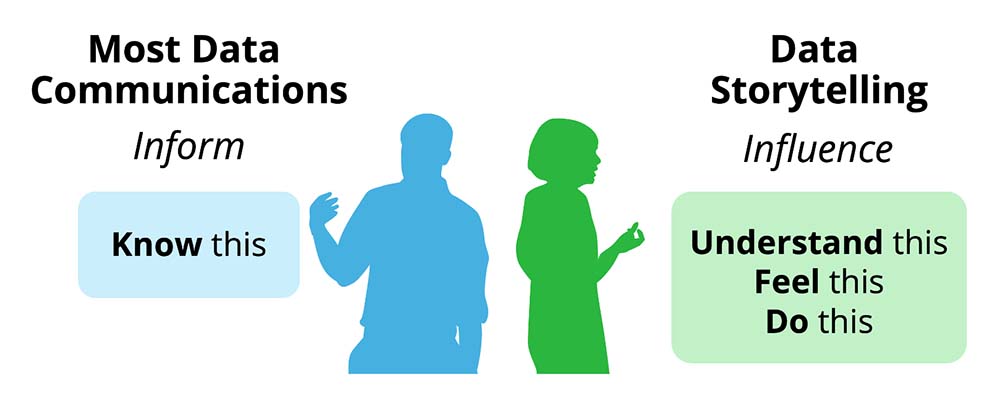
One of the first things you must recognize about data storytelling is that it’s fundamentally different from other forms of data communication. Most people are accustomed to sharing data in reports and dashboards to inform, not to influence or persuade. When you’re informing, you’re providing comprehensive information and letting decision makers draw their own conclusions.
Data storytelling flips this approach. When you’re focused on influencing, you must frame your content around a central message, guiding the audience to see what you see in the numbers and take specific action. You prioritize clarity and relevance over comprehensiveness because your goal is to inspire action with your insights. Rather than focusing on what you want your audience to know, you shift to: what do you want your audience to understand, feel, or do after seeing your data story? For many data professionals, this represents a significant mindset shift that can feel uncomfortable at first, but it's absolutely essential for turning insights into action.
2. Know your audience
Surprise, surprise. Before crafting a data story, it’s critical to understand your audience. Even the most powerful insight will fail to resonate if it doesn’t speak to something they care about. The better you know your audience, the more effectively you can tailor the story to them. As you think about your audience, ask yourself:
- What challenges are they facing?
- What outcomes are they attempting to drive?
- What decisions are they making?
- How familiar are they with the topic?
- How much context do they need?
- What level of detail do they expect?
- What concerns or objections might they have?
A strong data story meets its audience where they are—based on their priorities, knowledge level, and how they prefer to absorb information. Your role as the data storyteller is to make your insight accessible, relevant, and actionable for the people who need to hear it.
3. Find your storyline
When you're ready to turn your insight into a data story, having a clear narrative structure makes all the difference. A four-part approach works particularly well for guiding your audience from curiosity to understanding, and then to action:

- Setting + Hook: Start by providing just enough context to establish relevance, then introduce something unexpected to spark curiosity. This could be an anomaly, trend, or surprising pattern in the data—like a sudden 400% spike in website traffic. Your hook should make the audience curiously ask "what's going on here?" and want to learn more.
- Rising Points: Connect the dots between your hook and your main insight by sharing supporting findings. Think of this as building a case: each point should deepen the audience's understanding and logically lead toward your central discovery. For example, you might reveal that the traffic spike coincided with an increase in certain specific search terms or browsing behaviors.
- Aha Moment: Your key insight is the climax of your story. You’ll want to pair it with the “so what?” that reveals why it all matters. In our example, this might be that visitors are searching for a product recommended by a social media influencer, and that this behavior is driving a significant business opportunity.
- Solution + Next Steps: Don't leave your audience hanging after the big reveal. Provide clear, actionable recommendations for how to respond to your insight. When possible, give them options along with your recommendation and specify the required steps to move forward. For example, you may want to reach out to this social media influencer and collaborate on a future promotion.
I always recommend starting with your aha moment when planning your story. Then work backward to determine what hook and rising points will best set it up. Your storyline should feel like a logical journey from "something interesting is happening" to “this is why it’s important”, and finally "here's what we should do about it." This four-part structure—the Data Storytelling Arc—ensures your data story has the narrative flow that keeps audiences engaged while building toward meaningful action.
4. Design the visuals
Once you’ve mapped out your storyline, it’s time to bring it to life with supporting visuals. Think of your data charts as scenes in your story. They’re not just there to display data but to amplify your key takeaways and help the audience easily see what you see in the numbers.
Rather than designing data charts for monitoring or exploratory purposes, aim to make them explanatory charts. Your visuals should clarify and emphasize your key points. Start with your message, then design the chart to support it. Here are five ways to ensure your visuals reinforce your storyline:
- Headlines: This is where I recommend you start, not where you finish. Begin by writing the explanatory headline that captures your key takeaway, which informs how you design the chart. Skip vague titles like “Quarterly Revenue by region.” Instead, use explanatory headlines that clearly state the main takeaway (e.g., “North Region’s revenue surged 65% in Q3”). This sets expectations and helps direct the viewers' attention to what matters most.
- Simple charts: Choose the simplest form of visual that effectively conveys your message. Bar and line charts often outperform more complex options. Avoid novelty for novelty’s sake. Even if your data is complex, clarity should still be the primary goal.
- Declutter: Remove anything that doesn’t serve the story. Be selective about which data you retain from your analysis. Be careful with the default formatting of your charts. Whitespace is your friend as it helps focus attention where it counts.
- Highlighting: Draw the eye to what matters using color, contrast, and emphasis. Highlight the key bar, line, or data point instead of treating everything as being equal. Make the most important data stand out.
- Annotations: Don’t let your audience guess. Use concise callouts or text labels to explain unusual spikes, gaps, or shifts. They help the audience interpret meaning without relying solely on verbal explanation.

The charts of your data story can’t be treated as decorations. Every chart in your data story should earn its place by advancing and supporting your narrative. If it’s not actively helping your audience understand your key findings, remove it.
5. Practice and get feedback
Like any skill, data storytelling improves with practice. But that doesn’t mean you should start with a high-stakes presentation to senior leadership (in fact, I’d recommend you don’t). Start small instead. Try sharing a quick insight during a team meeting. Or begin applying storytelling techniques to business reports—like explanatory headlines or highlighting key takeaways—even if you’re not telling a full data story yet. The key is simply to start.
As you begin practicing, seek feedback from colleagues or your manager. Ask them:
- Was the main point clear?
- Was there enough context or too much?
- What felt confusing or unnecessary?
- What stood out the most or was most memorable?
- What action would you take based on this information?
As you incorporate their feedback and refine your approach, you’ll quickly see meaningful improvements. You don’t need to master everything at once. Focus on one area, and build from there.
Final thoughts: Your data storytelling journey
As you begin practicing these techniques, remember that you’re developing one of the most valuable skills in business today. The ability to make sense of the numbers and communicate what they mean to others is a gamechanger. Having spent time across the entire analytics process—from data collection to reporting and analysis—I can confidently say that helping turn insights into action through storytelling has been the most rewarding and impactful work I’ve done.
If you discover (like I did) that you love telling stories with data, I invite you to:
- Join my self-paced online Masterclass course for hands-on training and deeper skill-building.
- Or pick up a copy of my book, Effective Data Storytelling
- Follow me on LinkedIn where I frequently share data storytelling tips and tricks
These resources will give you practical tools and frameworks to grow as a data storyteller and drive real change in your organization. Organizations everywhere are searching for people who can bridge the gap between data and decision-making. I'd love to be part of your journey as you develop this game-changing skill.

.png)
Now Available: The Effective Data Storytelling Masterclass
Based on the bestselling book, this all-inclusive course is the ultimate guide you need to learn data storytelling.


