Five Excellent Data Storytelling Examples (And What Makes Them Work)
From time to time, I’m asked for good data story examples, which can be problematic. If you’re searching for real-world business examples, you’ll be hard-pressed to find anything meaningful. Most data stories happen behind closed doors and, sadly, there’s no incentive for organizations to share confidential or proprietary information externally. As a result, we’ll never hear how a data story inspired stakeholders to fix a broken process or capitalize on an untapped market opportunity.
If you want to improve your data storytelling skills by reviewing other people’s work, data journalism is the most accessible source of public examples. While these examples may appear to be comparable on the surface, business data stories operate under very different constraints:
- They need to drive decisions and actions, not just inform or educate
- They’re tailored to specific stakeholders, not the general public
- They’re built with everyday tools, not specialized software or custom code
- They guide audiences to a specific main takeaway, rather than explore multiple angles
- They’re typically delivered as live presentations, not videos or written articles
- They need to end with a clear recommendation and path forward
So, while their approach won't always align with how business professionals use data to drive decisions, we can still examine the underlying principles, draw inspiration from their creativity, and adapt what's relevant to our own context.
In this post, I’ll highlight five of the best data stories I’ve found online. While there may be brilliant data stories hidden behind expensive paywalls, I’m focusing on ones that are accessible to everyone. For each one, I’ll document why it works, what its standout feature is, and where it could be stronger. I’ll then wrap up with a summary of key lessons from all five examples.
200 Countries, 200 Years, 4 Minutes
Hans Rosling (BBC), Dec 2010, Length: 4:47
https://www.youtube.com/watch?v=jbkSRLYSojo
In one sentence: Despite wars, famines, and diseases, virtually every country in the world has gotten richer and healthier over the last 200 years, and the gap between rich and poor nations is closing.
Why it works: Rather than pointing to a series of static charts, Rosling becomes an integral part of the storytelling. He guides us through the numbers as he moves with the data, points at specific countries, and reacts to unexpected shifts. He injects his personality and unique sense of humor into his storytelling, making the abstract health numbers both approachable and engaging. The animated bubble chart also reveals a continuous journey rather than just a sequence of before-and-after comparisons, allowing the audience to experience 200 years of progress in real time. At one point, Rosling also breaks down the China data to show regional variations (3:40), adding nuance without derailing his central narrative.
Standout aspect: While unique to this presentation format, Rosling uses his physical and vocal reaction to bring emotional weight to the moment when the lifespan data dips suddenly due to WWI and the Spanish Flu (1:55)—something a static annotation could never replicate.
Where it could be stronger: Sometimes, his labeling approach could have been better, especially from a hierarchy perspective. Other than the overall years, which were oversized and noticeable, the rest of the labels blend together. It's a confusing mix of capitalized and uncapitalized lettering with similar sizing and color formatting, making it harder to distinguish between primary and secondary values.
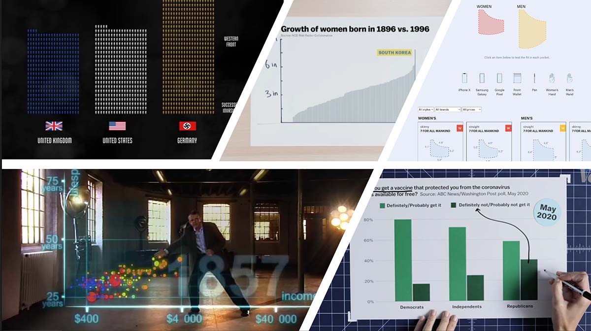
The Fallen of World War II
Neil Halloran, May 2015, Length: 18:30
https://www.youtube.com/watch?v=DwKPFT-RioU
In one sentence: World War II claimed lives on a scale that dwarfs every other conflict in human history, and the more than 75 years of relative peace that followed are more remarkable and fragile than most of us realize.
Why it works: Halloran opens by acknowledging that living memory of World War II is quickly fading and establishes the stakes for why this story needs to be told now. He carefully defines his unit of measure before the visualization begins, which is a small but critical move in ensuring the magnitude of the numbers is clear. From there, he layers data with animation, maps, sound, and music to guide the audience through mounting casualties as the war unfolds. His use of audio amplifies the emotional weight in ways the visuals alone couldn't achieve. At key moments, he reframes the data through different groupings, providing the audience with various perspectives on the same data. Finally, he contextualizes WWII losses against other wars and atrocities across human history, making the full weight of the conflict impossible to dismiss.
Standout aspect: One of the most powerful moments occurs when we see the side-by-side comparison of German and Soviet military deaths. Once the animated chart reveals 2.4 million German soldiers died (6:02), the Soviet bar continues to rise (and rise) for a painful 45 seconds until it finally reaches the official death count of 8.7 million (6:47). This moment is further enhanced by the haunting sounds of marching soldiers and howling wind in the background as the death tally grows.
Where it could be stronger: While Halloran attempts to provide a balanced perspective, he mainly focuses on the European theater. Even though the Pacific theater represented 41% of WWII deaths, it only receives about 90 seconds of coverage. When he mentions that over 16% of the Polish population died in WWII (9:38)—the highest proportion of any country—the statistic isn't annotated, making it easy to overlook despite its significance. At some points in the story, Halloran relies on generic silhouettes for civilians (8:56), which feel too contemporary and jarringly mismatched with the rest of the historically aligned visual storytelling.
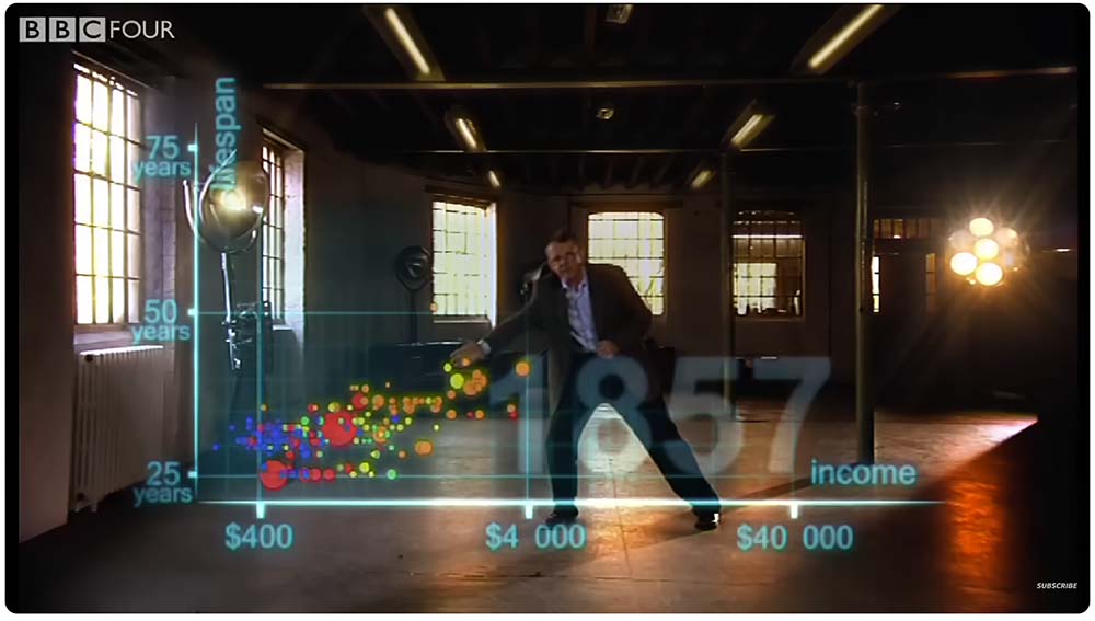
How South Koreans Got So Much Taller
Alvin Chang (Vox), Feb 2023, Length: 6:07
https://www.youtube.com/watch?v=ZoLk6GUKzU0

In one sentence: South Korean women grew nearly eight inches taller over the past century — more than any other country — revealing that human height isn't solely genetic but a direct reflection of nutrition and economic conditions as a nation rapidly industrializes.
Why it works: What immediately sets this piece apart is its personal dimension. Narrator Alvin Chang isn’t just sharing an interesting insight about South Korea. We learn it ties to his own heritage—he is the grandson of North Koreans who fled during the Korean War. Rather than relying on slick, highly produced graphics, Chang uses a series of hand-drawn and printed charts laid out on a table to tell his story. This tactile approach makes the data feel more intimate and approachable. The tradeoff between visual precision and intimacy pays off. Alongside the digital animation and screen graphics, the hand-drawn foundation makes it feel like a hands-on demonstration and less like a polished production (even though it definitely is).
Standout aspect: At the beginning of the story (0:50), Chang openly acknowledges the height comparison across countries doesn’t yield any clear patterns. He purposefully adjusts the axis scale to show growth changes rather than absolute heights. This shift reveals South Korea as an unmistakable global outlier, leaving the audience asking why the country grew so dramatically in such a short time.
Where it could be stronger: At one point in the story (1:43), Chang shares a printed line chart that shows how European male height from skeletons hadn’t changed much until the last 200 years. The section between the 1800s and 2000s is a noisy cluster of markers that obscures any clear pattern. Chang himself recognizes the limitation and quickly transitions to what he calls “some better data”—a cleaner chart that displays the average height of European men in the 1800s. The abrupt jump between charts highlights the previous chart’s ineffectiveness. Another minor but persistent issue is the use of yellow in some line charts, which is difficult to read against a white background.
How American Conservatives Turned Against the (COVID) Vaccine
Joss Fong (Vox), Feb 2022, Length: 14:47
https://www.youtube.com/watch?v=sv0dQfRRrEQ&t=103s
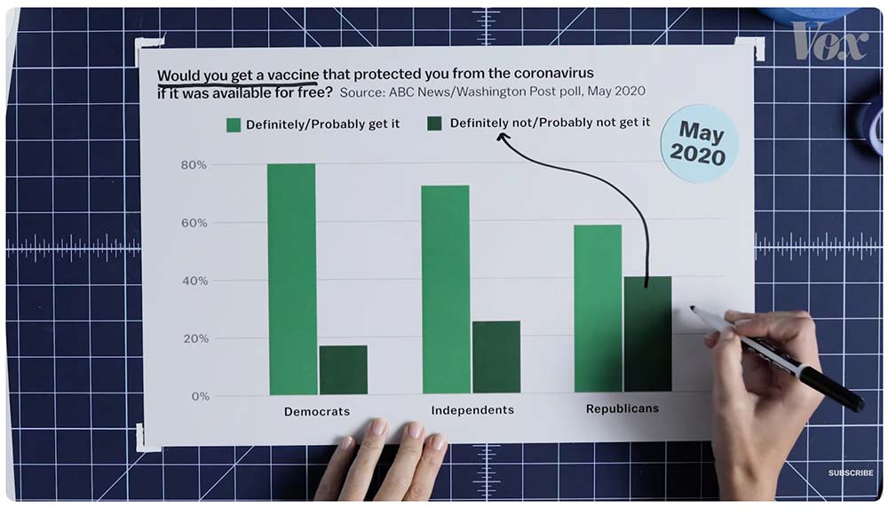
In one sentence: US conservatives were primed to reject the COVID vaccine even before it existed due to partisan polarization, fractured media trust, and conservative media’s early downplaying of the pandemic’s impact.
Why it works: Joss Fong weaves macro health data with individual accounts and news clips to build a richer picture of what was driving conservative vaccine resistance. She establishes how this opposition predated the vaccine by nearly a year (8:00), reframing the narrative from vaccine hesitancy to political identity. Like other Vox data stories, Fong uses printed charts, plastic transparencies, and hand-drawn annotations to tell her story. In this physical environment, she employs several distinctive techniques that enrich her storytelling:
- Cutting part of a chart with scissors to isolate a specific time period (0:21)
- Alternating between two charts to illustrate a shift (2:53)
- Flipping a transparency horizontally to show outliers (6:09)
- Adjusting a transparency upward to create an overlap and emphasize a difference (9:29)
Standout aspect: At one point (8:26), Fong introduces a chart showing Republican and Democratic opinions toward eight popular false claims. She places a mobile phone on the chart—blocking most of the categories—which plays a clip of a health researcher noting that many Republicans believed the government was exaggerating the number of COVID-19 deaths. She then unfolds the full chart to reveal the true height of the bar: more than 60% of Republicans believed this misinformation. The physical reveal transforms a data point into a dramatic moment in the story.
Where it could be stronger: At the beginning of the story (0:44), Fong shares how the Delta variant wave had a devastating effect on the US population. While she annotates the vaccinated and unvaccinated segments by hand, she missed an opportunity to reinforce a key point: the risk of death was 15 times higher for unvaccinated Americans. A simple “15x” annotation on the chart would have significantly reinforced the story’s central stakes. On a smaller note, I noticed a mislabeled axis (Jan ’21 in place of Jan ’22) on a line chart (10:00). Throughout the story, Fong painstakingly referenced sources to instill trust, but these kinds of oversights can quietly undermine it. On a minor note, the thumbnail image for this video features a scatter plot that doesn’t appear anywhere in the data story. It feels like a missed opportunity to set accurate expectations for potential viewers.
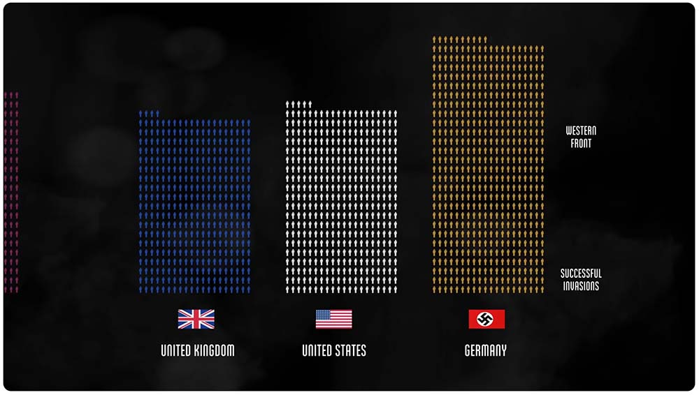
Women’s Pockets Are Inferior
Jan Diehm, Amber Thomas (The Pudding), Aug 2018
https://pudding.cool/2018/08/pockets/
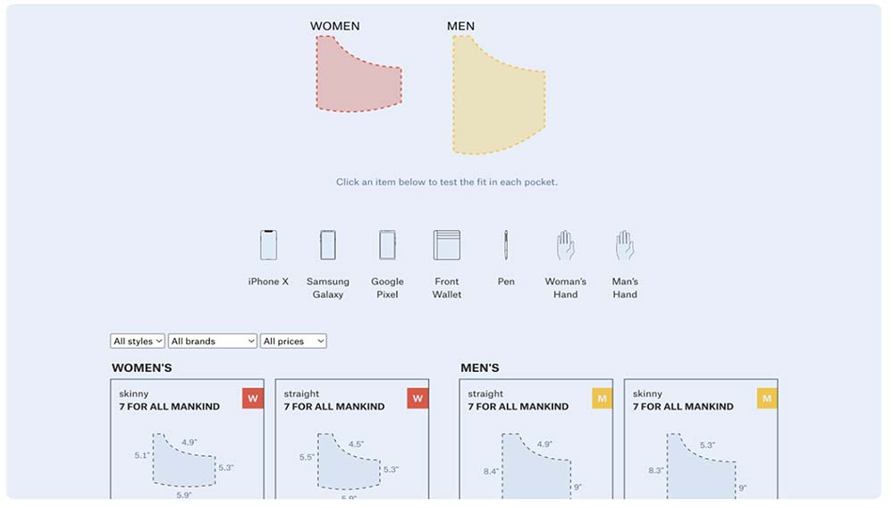
In one sentence: After measuring men’s and women’s pockets across 20 of the most popular jean brands in the US, The Pudding confirmed women’s frustrations that their front pockets are 48% shorter and 6.5% narrower than men’s.
Why it works: Diehm and Thomas open by acknowledging what every woman already knows to be true and then prove it with data. After gathering the average pocket measurements for 80 pairs of women’s and men’s blue jeans across 20 popular brands, they go beyond the raw dimensions to test whether common everyday items like phones, wallets, pens, and hands would fit. This functional test transforms the size comparison into a practical, relatable demonstration. They also anticipate the most obvious counterargument that men are simply bigger than women by controlling for waist size and only using jeans with a 32-inch waistband. They break down the data by jean style to confirm that regardless of cut—skinny or straight—men’s pockets are still noticeably larger. Finally, rather than forcing readers to go through their methodology, they place the detailed measurement process at the end for those who want to verify or dig deeper.
Standout aspect: Unlike interactivity that doesn’t serve the narrative or even pulls you away from it, this story’s interactive elements allow the readers to tailor the functional test to their gender, preferred brand, or everyday item while staying anchored in the narrative. The most striking discovery it unlocks is that the majority of women’s front pockets can’t fit a woman’s hand beyond the knuckles—a finding that needs no data literacy to understand. Readers can also toggle between average, biggest, and smallest pocket sizes, letting them interrogate the data at their own level of curiosity without disrupting the main narrative flow.
Where it could be stronger: At the end of the article, the authors provide historical perspective into how pockets diverged for men and women in the 17th century and were shaped by patriarchal perspectives of fashion over function. This important historical context should have come earlier in the story rather than burying it at the end. Compared to the other sections, the historical section is also devoid of any visuals or interactive elements. Even a simple timeline of pocket history with visual examples could have strengthened this section and the overall story.
Wrap-up Summary
Each of these data stories illuminates a subject in ways that raw data alone never could. They skillfully combine narrative, visuals, and creativity to make complex topics deeply engaging and highly memorable. Here are some key lessons we can take from them:
The best examples have a way of turning up in unexpected places and on unlikely topics. If you come across a data story that belongs on a list like this, please let me know. It must meet the following criteria: it is freely accessible, genuinely compelling, and demonstrates real craft worth studying. I'm always looking for new ones to feature in future posts.

.png)
Now Available: The Effective Data Storytelling Masterclass
Based on the bestselling book, this all-inclusive course is the ultimate guide you need to learn data storytelling.


