Measurement Over Metaphor: Rethinking The Conversion Funnel

For as long as I’ve worked with data, I’ve wrestled with one particular visualization—conversion funnels. If you’ve worked in sales or marketing like I have, you’ve probably seen countless versions of conversion funnels across different platforms—no two quite the same. Each analytics tool puts its own spin on the design, leaving us with a confusing mishmash of variations. The lack of a standard isn’t due to creativity but rather a sign that the funnel chart is more complicated and problematic than other charts.
A funnel chart shows how a cohort or group of people progresses through a process. To evaluate how effective the process is, funnel charts typically display a combination of the following three metrics:
- Stage-level counts (primary): Throughput counts for different stages of a process (e.g., 2,000 made it to Stage 2).
- Stage-level conversion rate (primary): What portion of the cohort reached each stage (e.g., 50% of all people reached Stage 3).
- Stage-to-stage conversion rate (secondary): What portion of the cohort who reached a stage continued to the next one (e.g., 40% that reached Stage 3 continued to Stage 4).
Balancing these different metrics in a single visualization is part of what makes funnel charts more challenging to design. While conversion funnels are heavily used in sales and marketing scenarios, they can be useful for all types of processes where people or items pass through different stages, milestones, or checkpoints toward a final outcome.
For example, conversion funnels can be useful in tracking various processes or journeys such as product onboarding, HR recruitment, customer support, patient treatment, student graduation, manufacturing yields, and so on.
The five visualization challenges of funnel charts
Despite the apparent utility of this chart type, funnel charts are less standardized and consistent than other visualizations. Visualizing processes as a funnel can be challenging for the following reasons:
1. Funnel visual metaphor
There’s an implied funnel shape associated with this scenario. At the top, you have a larger volume coming in, and as it progresses through, less volume comes out at the bottom. The top of the funnel tapers from stage to stage until it reaches the narrow bottom. This familiar shape feels intuitive—people naturally understand that wide means many and narrow means few.
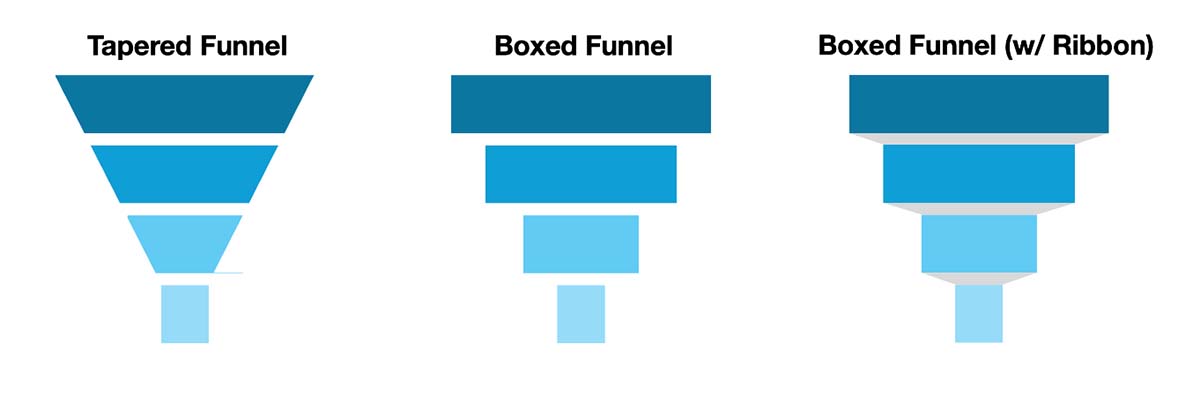
In some cases, the design of the chart closely mirrors a funnel by making each section tapered or sloped. While this approach better represents a funnel, it’s more difficult to compare the size differences between stages. Many analytics tools instead employ a stack of centered boxes, which are somewhat easier to compare even though they lack a shared baseline for comparison purposes. You might also see a hybrid approach that links together the boxes with a ribbon.
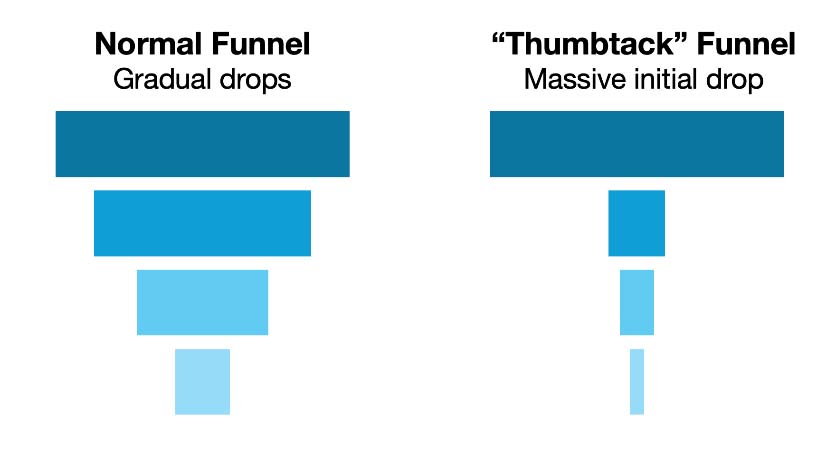
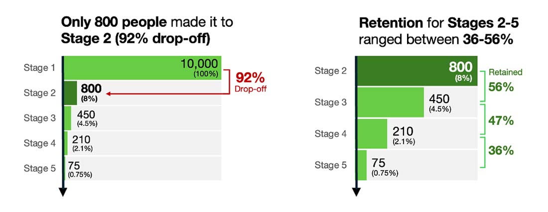
Depending on the size of the drop-offs between stages, you can end up with odd-shaped funnels that break the funnel metaphor. For instance, if Stage 1 has 10,000 users but Stage 2 only has 500, such a dramatic drop-off will look less like a funnel and more like a thumbtack.
To preserve the expected funnel shape, some tools overlay values on a fixed funnel outline. They encode values into the height or area of each stage, but the irregular shapes make it difficult to compare their sizes.
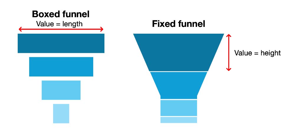
I’ve also seen analytics tools use a static funnel shape and just overlay the stage values on it. While this preserves the expected funnel shape, it distorts what’s happening between the stages, making it easy to overlook a severe drop-off.
2. Multiple competing metrics
Because funnel charts may need to communicate three different types of information simultaneously, it can be challenging to know which metrics to emphasize, where to place them, and how to avoid visual clutter. This creates a tug-of-war between clarity and completeness. Many tools only focus on stage-level counts and overall conversion rates. While omitting the stage-to-stage rates reduces confusion, it can also hide the biggest drop-offs.

3. Emphasis on continuation over drop-offs
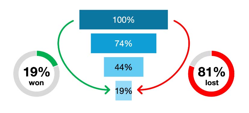
Funnel charts highlight what remains rather than what’s lost at each stage. Sometimes, the emphasis on continuation can mask the magnitude of the drop-offs that are occurring at each stage. For instance, a funnel showing that 19% of users reach Stage 4 emphasizes the retention, while the fact that more than 80% dropped out across the four stages gets downplayed. Because drop-offs aren’t visualized, they become invisible and the audience might overlook serious issues in the conversion funnel.
4. Labeling constraints
The wide-to-narrow shape of funnel charts complicates how stage names and values are displayed. As the funnel tapers, the narrower sections at the bottom leave less room for text, often forcing labels to be placed outside the funnel or stacked unevenly along its sides. When the values are positioned in a staggered fashion, it becomes harder for viewers to scan and compare them quickly. This issue is further complicated when the earlier stages have much larger scales of numbers than the later stages.
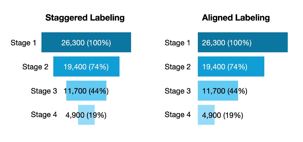
Designers frequently face a trade-off between preserving the funnel metaphor and maintaining legibility. The more you adhere to the sloped shape, the more labeling flexibility you lose. That’s why some designers opt for left-aligned funnel charts, which keep labels consistently aligned making the values easier to read.
5. Comparison difficulties
The centered alignment of a funnel chart forces people to judge the relative lengths without the help of a shared baseline—a task made even harder when the funnel has sloped or tapered edges. If precision matters, a left-aligned bar chart provides a shared baseline that makes it easier to judge differing sizes.
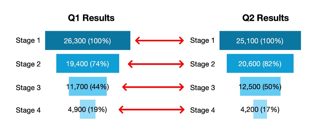
Comparative analysis becomes even more challenging when you need to evaluate performance across time periods, cohorts, or other dimensions. For instance, comparing Q1 vs. Q2 conversion funnel performance requires viewers to scan back and forth between separate funnels. When combined with the alignment and labeling issues noted earlier, side-by-side funnel comparisons quickly become cumbersome, imprecise, and cognitively taxing.
Even though conversion funnels are widely used in sales, marketing, and product scenarios, the default funnel chart continues to be a blunt instrument. While it looks intuitive, it is still difficult to interpret. It introduces distortions, hides drop-offs, and struggles with comparative analysis—making it an inadequate tool for measuring process performance. After years of seeing the funnel metaphor get in the way of understanding, I decided to rethink it from the ground up.
Choosing measurement over metaphor
While I love analogies and metaphors—especially visual ones—the more funnel charts look like actual funnels, the less useful they become. The advantages of abandoning the funnel metaphor outweigh the benefits of keeping it. Even though the funnel shape is familiar, it too often interferes with accurate interpretation.
That’s why I recommend a bar-chart-influenced approach. I’m not the first to advocate for it, but I’ve added a few refinements to address some of its weaknesses.
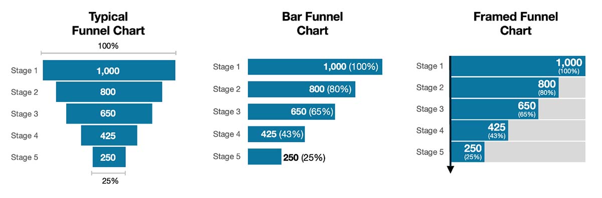
With my Framed Funnel Chart approach, I use framed bars instead of just normal bars. The grey frame restores the ‘part-to-whole’ context that’s lost when funnel stages are shown as standalone bars. While the drop-offs may not be the main focus, they should be present even if they’re just kept in the background.
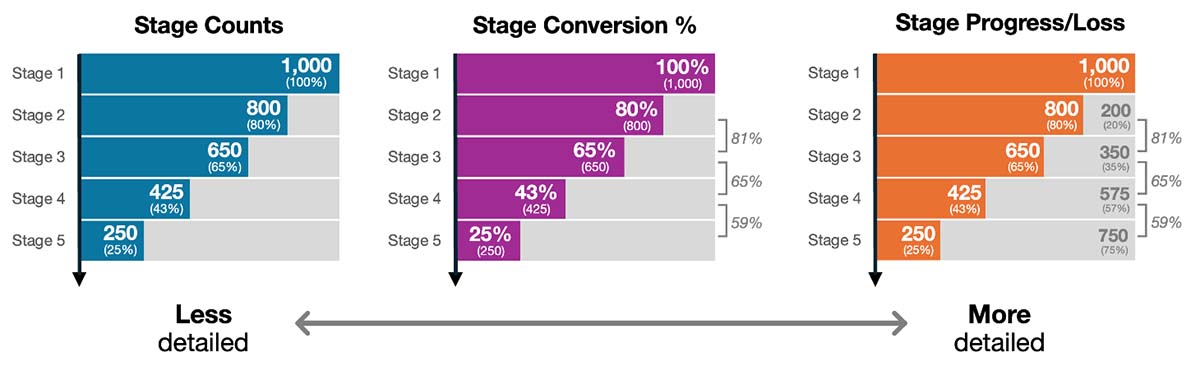
To preserve the directional flow of the stages, I’ve reduced the gap between the bars and added a simple arrow along the baseline to indicate progression or continuity. You’ll also notice I’ve introduced visual hierarchy and bolded the primary metric (stage totals) to emphasize it over the secondary metric (stage conversion rate). While these tweaks are subtle, they address many of the identified problems that plague traditional funnel charts and further enhance the comparison advantages offered by bar charts.
Depending on the purpose of your data communication, you can add more detail to the Framed Funnel Chart or highlight the metrics that are the most meaningful to your audience. In a report or dashboard scenario, you may provide more detail whereas in a data story you may strip away unnecessary detail and focus on key aspects of the chart.
For data storytelling purposes, you can use color to highlight key aspects of the funnel that you want the audience to focus on. In this example, I’ve highlighted the big drop-off from Stage 1 to Stage 2. The potential thumbtack effect isn’t as dramatic now because the data has been decoupled from the funnel shape. However, large differences between values can still create visualization challenges for many charts. In this case, I’ve used another Framed Funnel Chart to zoom into the results for Stages 2-5, which are much smaller than the Stage 1 value (10,000).
When comparing multiple funnels
Instead of having to rely on side-by-side comparisons of funnels, with the framed bars approach, you can make the comparisons more user-friendly. In these examples below, I’ve integrated two quarters into the same funnel chart and three months into another, so the comparisons are easier and more precise. For these grouped bar versions, I’ve widened the gap between the stages, so they don’t interfere with making series comparisons.
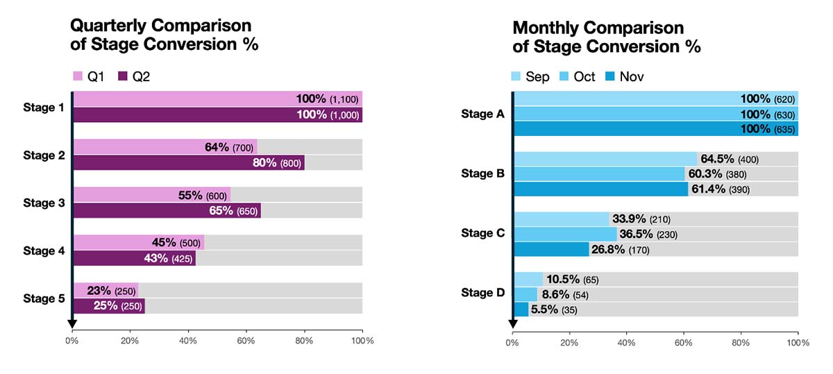
If you were interested in comparing the absolute values instead of percentages, I recommend shifting to a traditional grouped bar chart as the Framed Funnel Chart emphasizes composition (part-of-whole) and the totals won’t be uniform across different time periods.
The Framed Funnel Chart prioritizes measurement over metaphor. It retains the visual sense of flow but also emphasizes precision, alignment, and comparability. It transforms your conversion funnel data into something that is functional and no longer just figurative. The next time you build or present a funnel chart, will you choose metaphor or measurement?
Note: I’m not aware of any analytics tool that supports the label formatting you see in my examples. My images are a combination of manual edits in Excel and PowerPoint.

.png)
Now Available: The Effective Data Storytelling Masterclass
Based on the bestselling book, this all-inclusive course is the ultimate guide you need to learn data storytelling.


