The Key Elements Of A Good Data Story (And Why Visuals Aren't One of Them)

Most data presentations don't fail because of incorrect data or bad charts. They often miss the mark because the person presenting had no clear destination in mind. In the excitement to share their findings, they lose sight of where they're taking their audience.
I recently asked 350 data professionals on LinkedIn what they thought the most important element of a great data story was. Nearly half (49%) said a clear, powerful insight. Another 35% said strong narrative flow. Only 9% said a compelling hook, and just 7% said effective visuals. In truth, all these elements matter (some more than others), and none of them work in isolation.

A good data story isn't a collection of interesting findings dressed up with visuals. It's a deliberate journey from a compelling opening to a meaningful conclusion, with everything in between pulling the audience forward. When it works, decisions get made. When it doesn't, insights get ignored.
For me, there are three core pillars that turn an average data story into a good one that is engaging, memorable, and persuasive. If any one of these three pillars is missing, your data story will struggle to connect with an audience and inspire them to act.
The Three Core Pillars of a Good Data Story
Every effective data story is built on three foundational pillars:
- The Hook. It captures the audience's initial attention and makes them care.
- The Aha Moment. This is the main insight and its impact—the primary climax and intended destination of the entire story.
- Narrative Flow. The connective tissue that holds everything together.
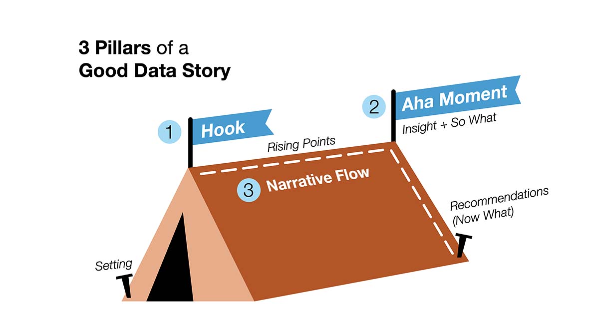
It’s worth noting that the Hook and Aha Moment aren’t separate from the Narrative Flow. They are actually its two most critical anchors with the Narrative Flow connecting them and everything in between. I like to think of them as the tent poles of a good data story. Without them, the whole structure collapses.
You'll also notice that visuals aren't listed as a core pillar. That's intentional. Data storytelling is built on three elements—data, narrative, and visuals—but of these, visuals are the dependent element, not a foundational one. They serve the Hook, the Aha Moment, and the Narrative Flow. They're the vehicle, not the destination. Great visuals can't save a weak story, but a strong story can survive imperfect visuals.
Let's dig into each pillar.
Pillar 1: The Hook
If the Aha Moment is where you're taking your audience, the Hook is what gets them to come along for the ride.
A good Hook generates immediate interest or intrigue. It signals to the audience that what they're about to hear matters to them, not just to you. And that last part is critical. A Hook that's interesting to the analyst but irrelevant to the audience is no hook at all. If they don't care about your opening, your story is dead before it starts.
The Hook typically works by introducing tension or contrast. It’s a surprising or counterintuitive data point—something that makes the audience lean in and think, "Wait, really? Tell me more." But for that contrast to land, the audience needs a baseline to compare it against. That's where context comes in.
Setting up the Hook
Before you can hook an audience, they need to understand what "normal" looks like. What's the status quo? What's expected? Without that baseline, the Hook has nothing to push against.
This doesn't mean you need to spend ten slides establishing background. In fact, one of the most common mistakes I see in data storytelling is lingering in setup so long that you lose the audience before you ever get to the interesting part. They're nodding along through information they already know, waiting for something to happen. If you take too long to reach the Hook, your audience may have already mentally checked out.
I have a simple rule: include ‘just enough’ context to make your Hook land and nothing more.
Pillar 2: The Aha Moment
The Aha Moment is the heart of your data story. It's the reason you're telling the story in the first place. It's the combination of two things working together: the insight and the So What.
The Insight
I've always liked Gary Klein's definition of an insight: an unexpected shift in the way we understand something. An insight is not just a fact. It's not just a trend line going up or down. It's a moment where the audience genuinely sees something differently than they did before. Insights challenge existing assumptions and shift perspectives in new directions.
One of the most common failures I see is data stories that don't have a clear insight at their core. Instead, they present a lot of interesting information—metrics, comparisons, charts—all loosely connected but pointing nowhere in particular. Without a clear insight, there's no destination. And without a destination, there can be no clear recommendation or action. The story just fizzles.
The So What
Here's where a lot of otherwise good data stories stumble: they have a real insight, but they stop short of contextualizing it. They tell the audience what happened, but not why it matters.
The So What is where you translate your insight into terms the audience actually cares about. In most business contexts, that means quantifying it in terms of financial gain or loss. In other words, what does this cost the organization? What could it save? How much revenue or profit could it generate?
When you put a dollar figure on an insight, something shifts. Abstract suddenly becomes concrete. "This is a problem" becomes "this is costing us $2.4 million a year." The ambiguity disappears, and with it, the audience's excuse not to act. If you leave the So What vague, you're essentially asking your audience to figure out why they should care. Many of them won't bother.
Pillar 3: Narrative Flow
Many people say a story has a “beginning, middle, and end.” I find this saying too vague to be useful as many non-stories can fit into those three wide buckets. The real secret is in what happens within those three acts, not that there are three of them. If the Hook gets them in the door and the Aha Moment is the destination, Narrative Flow is how you get from one to the other. It may be the most important and underappreciated pillar of all.
As I mentioned at the beginning, the Hook and the Aha Moment are two tent poles of the Narrative Flow. If they are not solid or missing, your data story crumbles. However, that doesn’t mean the rest of the structure isn’t equally critical. Even if your Hook and Aha Moment are strong, the Narrative Flow is what transforms a collection of data points into a cohesive, persuasive story. It's the difference between a presentation that feels like a purposeful journey and one that feels like a sudden push off a data cliff or a meandering stroll through a spreadsheet.
In practice, the Narrative Flow encompasses two things: the sequential Rising Points that build the case between your Hook and your Aha Moment, and the recommendations (Now What) that follow the Aha Moment. Together they determine whether your audience arrives at your insight feeling like it was inevitable and momentous, or feeling lost and disinterested.
Rising Points and Recommendations (Now What)
In a great film or novel, everything happens for a reason. Every scene, every line of dialogue, every plot development advances the story toward its conclusion. Nothing is there just to fill time. The same principle applies to a data story. Every data point, every chart, every finding needs to earn its place. If it doesn't advance the story toward the Aha Moment, it either gets cut or goes in the appendix.
Rising Points are the carefully selected data points and context that unpack the problem and lead the audience step-by-step toward the insight. They are the product of synthesizing the critical findings into something meaningful and insightful. Often the Rising Points reveal cause-and-effect relationships, showing not just what happened, but why it happened and what it led to. They help connect the dots in your audience’s mind and guide them toward understanding your insight.
Just like no good movie ends at its climax with no closure, a good data story must continue to guide the decision-makers to what they should do next. Without recommendations, a powerful Aha Moment can leave the audience informed but paralyzed—they understand the problem but don’t know how to move forward. The best data stories don’t just change how people think, they change what people do.
Why Visuals Aren’t a Pillar
For too long, data storytelling has been treated as a synonym for data visualization. Many people still refer to isolated data charts as “stories.” Many people who have received “data storytelling” training learned how to build explanatory charts—certainly useful but far from complete. Skilled choreographers can create engaging scenes, but only a talented director can piece them together into a cohesive and meaningful story.
When you’re tasked with communicating complex findings, clean, clear visuals are non-negotiable. If your charts are cluttered, confusing, or hard to read, they can undermine even the strongest story. On the other hand, well-designed charts cannot save a weak insight nor can they compensate for poor narrative flow.
Summarizing is Not Storytelling
Most busy executives have demanding schedules and short attention spans. Executive summaries have become a common form of communicating data. You might be tempted to lead with your Aha Moment and put the insight upfront, executive-summary style. This is a common instinct, especially for analysts trained to "not bury the lede.” While I recognize the need to deliver insights quickly, you’re making a tradeoff between efficiency and effectiveness. No one can expect a movie trailer to carry the same weight and impact as a feature film. The same applies to a summary of a data story versus an actual data story.
When you reveal the insight upfront, you add a shortcut to the journey, but not without a toll. The audience receives the key information, but without the buildup they’re less likely to feel its weight, comprehend it as deeply, or be moved to act on it. An executive summary is efficient at transferring information quickly. A data story is effective at creating deeper understanding and driving action. They serve different purposes, and they require different approaches.
If you truly want to build a data story that inspires and not just informs, the three highlighted pillars are essential to its success. Without a strong Hook, the audience may quickly lose interest in hearing the rest of your story. Without a clear Aha Moment, your audience will follow the data but arrive nowhere. Without a solid Narrative Flow, the audience will become frustrated as data points feel disjointed and random with nothing tying them together. But when all three work together, you have a data story that doesn’t just provide information but deepens understanding and inspires action. That’s all you can ask of a good data story.

.png)
Now Available: The Effective Data Storytelling Masterclass
Based on the bestselling book, this all-inclusive course is the ultimate guide you need to learn data storytelling.


