Why Charts Designed For Dashboards Fail In Data Stories

A common challenge I see in my workshops is people trying to repurpose charts from their dashboards for presentations and reports. When the visuals fail to have the impact they expected, they’re puzzled. The data was solid, and the chart was clear—so what went wrong?
Even though both dashboards and data stories leverage data visualizations, they require fundamentally different design approaches.
Think of it this way: Dashboards are like paper maps. They show everything and let the audience decide where to go. Data stories are like GPS navigation. They guide the audience to a specific destination. Both tools display the same geospatial data but differently to serve different purposes.
To make these differences easier to spot, I'll use four key lenses. Each lens represents a tradeoff between competing priorities that shapes how a visual is constructed. In this article, I’ll use a simple bar chart example that shows regional sales performance and discuss how the design decisions differ in dashboards versus data stories.
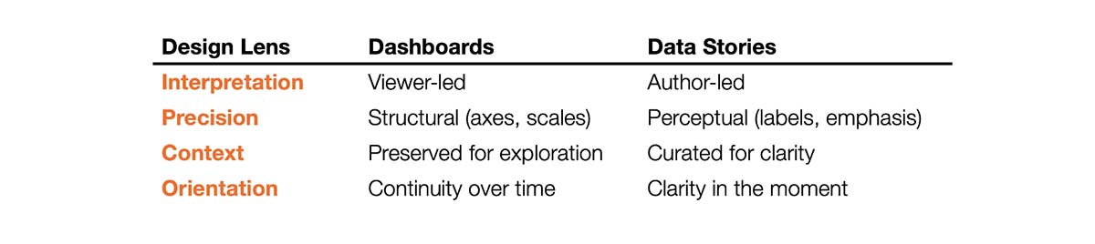
Lens #1 - Interpretation: Viewer-led vs. Author-led
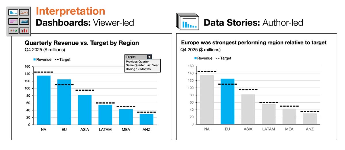
Dashboards: The chart is designed for monitoring and exploration. Interpretation is delegated to the viewer. The author intentionally avoids directing attention to any specific data points. No regions are highlighted, and all are treated as equally important. The title is descriptive but intentionally non-specific because the main takeaway can shift from period to period. The design goal is to support multiple possible interpretations, often with interactivity (filters, drilldowns, tooltips) to enable viewer-led exploration.
Data stories: The author takes responsibility for interpretation and shapes everything—headlines, emphasis, and hierarchy—to guide the audience toward a clear takeaway. In this example, the headline establishes Europe as the focal point, reinforced visually by the blue highlight.
Lens #2 – Precision: Structural vs. Perceptual
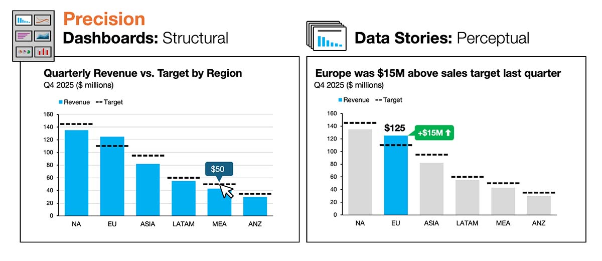
Dashboards: Precision lives primarily in the chart’s structure—axes, ticks, gridlines, and interactive tooltips—so viewers can estimate or retrieve exact values as needed. Because the author can’t predict what different viewers will care about, the chart must support many potential observations. Gridlines, for example, help viewers estimate values for regions that aren’t close to the y-axis. Tooltips are heavily relied on to reveal exact values on mouse over.
Data stories: Precision is delivered more perceptually because the author does know where attention should go. Key values are labeled directly, reducing estimation and lowering cognitive effort by the audience. The numbers don’t disappear; they move from the chart’s scaffolding to the author’s emphasis. In the example on the right, Europe’s sales total ($125M) is directly labeled on the highlighted bar. Europe’s overperformance (+$15M) is also surfaced in the headline and reinforced with an annotation.
Lens #3 – Context: Preservation vs. Curation
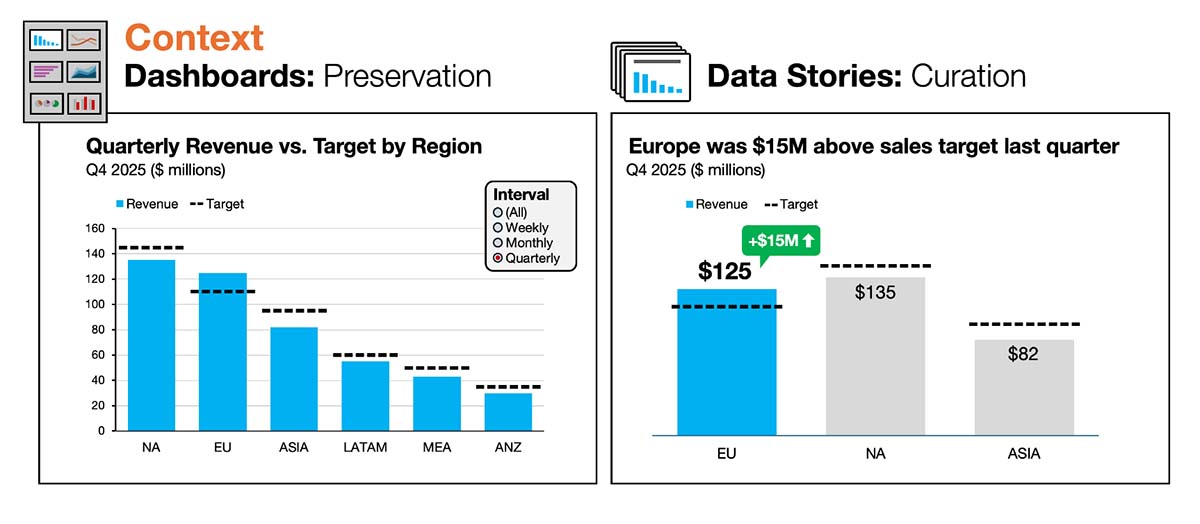
Dashboards: To preserve full context, the chart retains all categories so viewers can compare any regions, including edge cases. If the viewer wants to narrow the focus, they can apply filters. That means the author must anticipate which filters will be useful and ensure the chart still works when those filters are applied. The default view often starts unfiltered so viewers can assess the full dataset and drill in as desired.
Data stories: Instead of overwhelming the audience with nonessential information, the author curates just enough context. Less important information is removed or muted so the focus stays on the central message. The goal isn’t completeness—it’s clarity. Anything that remains earns its place by supporting the takeaway. In the example on the right, the author narrows the view to just three regions: Europe plus the next two largest regions for context and comparison. The regions are also reordered so Europe appears first. The smaller regions didn’t provide meaningful comparisons, so they were removed.
Lens #4 – Orientation: Continuity vs. Clarity
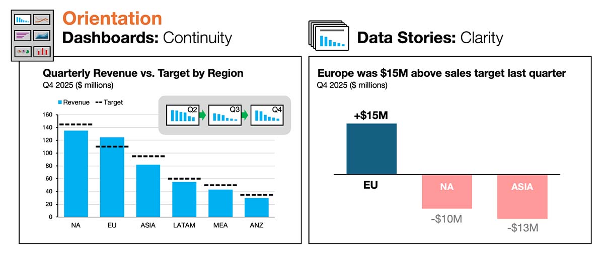
Dashboards: Because dashboards typically provide updates across consistent timeframes (daily, weekly, monthly), they are oriented toward continuity. Visual consistency builds trust and helps viewers to quickly interpret refreshed data. As a result, the author must design for a broader range of scenarios than just the current period. They don’t want the chart to “break” because it was optimized for an unusually slow quarter or an unusually strong one. Ideally, the chart looks consistent from any time period to the next.
Data stories: Clarity is paramount for charts used in data stories. When the question or emphasis changes, the design must shift—even if that means breaking consistency to improve understanding. In the example on the right, the author focuses explicitly on regional performance relative to target by switching to a deviation bar chart. If clarity improves by adjusting the structure, metric, or chart type, the visual is optimized for the takeaway—not for reuse.
Better storytelling requires a shift away from dashboard design standards
These four lenses—interpretation, precision, context, and orientation—represent the core tradeoffs between dashboard and story design. Understanding them helps explain why the transition from dashboards to data stories can feel difficult.
On the surface, they both rely on many of the same skills:
- Strong data literacy and analytical rigor
- Understanding of chart types, visual encodings, and human perception
- Commitment to accuracy, integrity, and respect for the audience’s time
The challenge is that analysts who’ve built dashboards for years have often been trained to avoid the very behaviors that data stories require. That experience can produce several predictable struggles when they shift into storytelling:
- “I don’t want to bias the audience.” Dashboard builders are conditioned to stay neutral and let viewers decide what matters. In storytelling, the absence of guidance often creates ambiguity and confusion.
- “I can’t anticipate what people will focus on.” Dashboards support monitoring and exploration, so the design must be flexible for different users and questions. Data storytelling isn’t about supporting many questions at once but about answering one clearly.
- “I don’t want to hide information or remove context.” Completeness is a virtue in dashboards, and removing information can feel manipulative. In data stories, too much context can drown out the takeaway. What feels like transparency in a dashboard quickly become noise in a story.
- “People always need exact numbers.” Dashboards often rely on detailed axes, gridlines, tables, and tooltips to provide precision on demand. In a data story, simplification isn't about “dumbing it down.” It's about reducing cognitive effort so the audience can focus on what matters.
To overcome these misconceptions, it helps to recognize that none of them are technical problems. They map directly to the four design tensions outlined above.
To be blunt, many of the habits that make someone an excellent dashboard builder can work against them when they’re asked to tell a data story. That’s not what anybody wants to hear, but it’s essential to recognize that a shift in approach is required.
The next time you add a dashboard chart to a slide, pause and ask this one question:
Is this a good chart design for a dashboard? Or a story?
Dashboards and data stories are complementary forms of data communication. On the surface they appear similar—like paper maps and GPS navigation—but they’re different tools for different jobs. The more deliberately you use these lenses and recognize the tradeoffs, the easier it becomes to design your visuals with confidence.

.png)
Now Available: The Effective Data Storytelling Masterclass
Based on the bestselling book, this all-inclusive course is the ultimate guide you need to learn data storytelling.


